Shop Conference Displays & Backdrops
What an attendee actually sees first
A conference hall is a wall of competing color, and attendees decide whether to stop before they read a single word. What registers first is height and shape, then contrast, then your name. Signage that fails usually fails on the first two, not on the design.
That is why a short table sign and a full height backdrop do different jobs. The backdrop claims the space and makes you look established from thirty feet away. The banner and the table cover carry the message once someone is in front of you. Buying only one of them leaves a gap.
The four pieces a standard conference booth is usually missing
If you can only add one this year, add the backdrop. It changes how your booth reads from a distance more than any other single piece, and it is the piece attendees stand in front of in photos.
| Piece | What it solves | Where it goes |
|---|---|---|
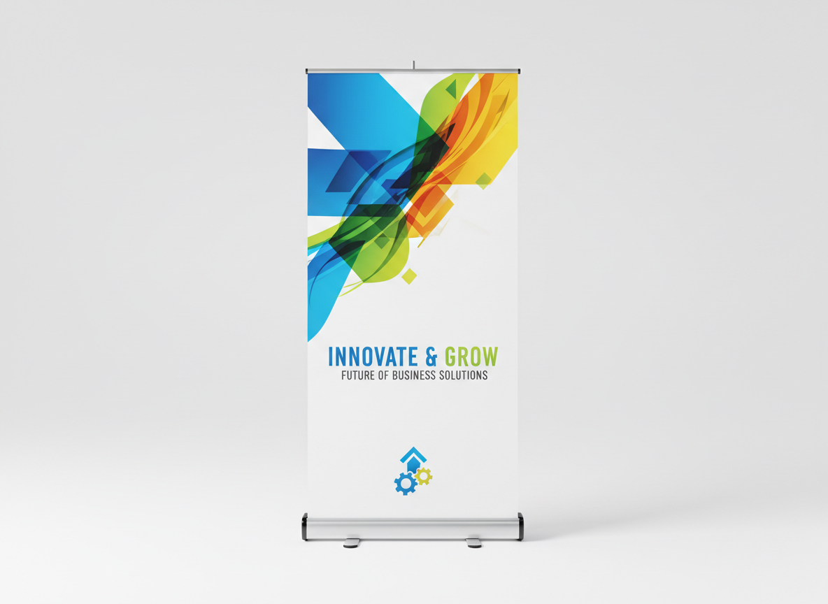
| Retractable banner | Puts your core message at standing eye level, where people actually look | Beside the table, facing the aisle |
| Tension fabric backdrop | Hides the hotel wall and makes the booth look built rather than rented | Directly behind the table |
| Step and repeat | Turns every photo and press shot taken in your space into a branded asset | The open corner of the booth |
| Branded table cover | Finishes the footprint and hides boxes, bags, and cables | The whole table, front and sides |
Sizing for a standard 10x10 conference booth
- Backdrop: an 8 ft or 10 ft wide tension fabric wall spans the booth and still leaves room at the sides to enter.
- Retractable banner: the standard 33 in x 81 in stands just above shoulder height, readable over a crowd of seated attendees.
- Step and repeat: a 6 ft by 8 ft panel is enough for a two person photo without cropping your logo out of frame.
- Table cover: a fitted 6 ft cover reads cleanly from the front; a throw is faster to set up but puddles on the floor.
- Directional or session signage: keep the format landscape and short. Signs read at a glance or not at all.
Placement rules that hold up in a conference hall
- Keep your most important line inside the eye level band, roughly chest height to just above head height. Anything near the floor gets blocked by people standing in front of it.
- Check contrast in the room's actual lighting. Hotel ballrooms run bright overhead, which washes out pale backgrounds and thin type.
- Face the aisle, not the back wall. Signage is judged from where people walk, even when that means angling a banner away from your table.
- Leave a clear sightline to your staff. A wall of signage in front of the table keeps people from starting a conversation.
- Weight every freestanding piece. Conference carpet, hotel air handling, and foot traffic all move lightweight stands.
Artwork that survives a conference hall
Send vector files (PDF, AI, EPS) where you can, or a high resolution PNG sized to final dimensions. Large pieces are viewed from a distance, so simple layouts with heavy contrast and one clear line of copy outperform detailed graphics every time.
Fabric displays stretch their print over a frame, which softens fine detail slightly. Keep type large and thin strokes out of small copy. Upload your artwork and the free artwork check flags resolution, bleed, and contrast problems before the order goes to production.
Conference Signage Questions
Keep Exploring
Trade Show Displays
Full booth kits, modular displays, and backlit walls for the show floor.
Custom Event Tents
Outdoor pop up tents with printed canopies and walls.
Custom Feather Flags
Tall printed flags that get attention before anyone reaches the booth.
Free Print Templates
Download artwork templates sized to banners, backdrops, and table covers.
Event Success Hub
Guides on booth setup, signage placement, and getting noticed.
How Ordering Works
From artwork upload to delivery in a handful of steps.